Design studies

Complete site builds, made to be judged before you commission one.

Each study takes a firm in the legal industry, works the brief through to a finished, functioning site, and leaves the reasoning on the table. Different corners of the legal industry, different problems, deliberately different directions.

These are concept studies. Firms, figures, matters, and testimonials are illustrative and describe no real entity or outcome. Photography is licensed stock; people shown are models.

Meridian Legal Services — homepage
/assets/ds-meridian-dynamic.jpg
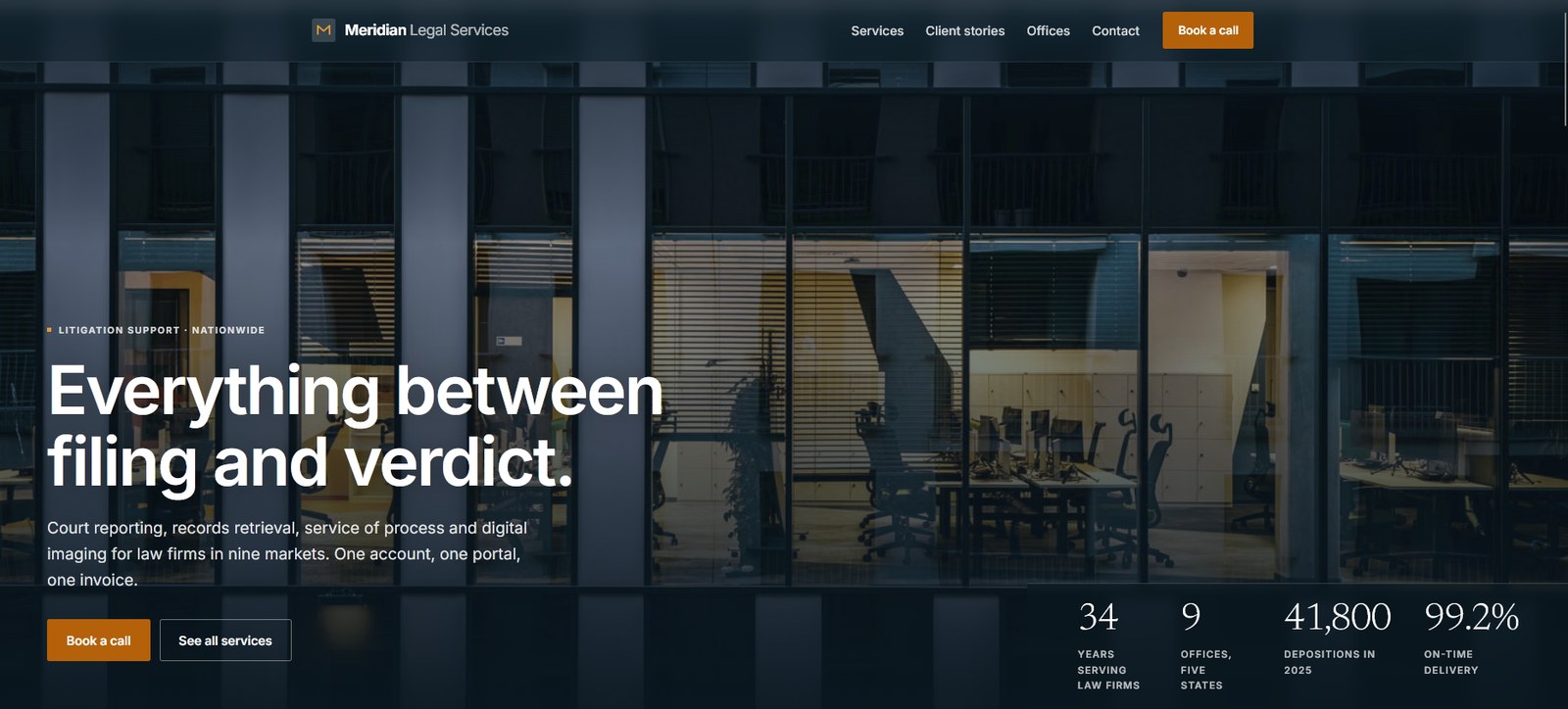
Meridian Legal Services homepage — hero with headline "Everything between filing and verdict."
Study 01·Litigation support·Multi-service / operational

Meridian Legal Services — eight service lines that had to read as one account.

Court reporting through mobile notary, nine offices across five states, operating since 1991. The buyers are firm administrators who already juggle three or four vendors and are not looking for a fifth. The site's argument is consolidation, and the obstacle is that consolidation sounds like risk.

Hale & Corvin — homepage
/assets/ds-hale-corvin.jpg
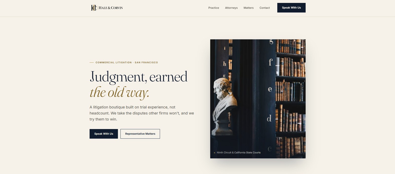
Hale & Corvin homepage — hero with headline "Judgment, earned the old way."
Study 02·Commercial litigation·Boutique / editorial

Hale & Corvin LLP — a boutique that competes on trial record, not headcount.

Fourteen partners, no associates layer, San Francisco. Its buyers are general counsel who can hire anyone, and who read a small firm's site looking for the reason not to. The design problem is proving seniority without the scale signals a large firm gets for free.

Halvorsen Kite — homepage
/assets/ds-halvorsen-kite.jpg
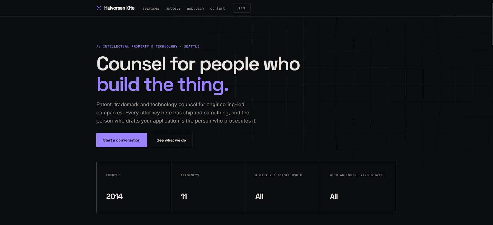
Halvorsen Kite homepage — hero with headline “Counsel for people who build the thing.”
Study 03·Intellectual property & technology·Dark / engineering-led

Halvorsen Kite — patent counsel sold to the engineers, not the board.

Eleven attorneys, all registered before the USPTO, all with an engineering degree. The people who choose IP counsel at an engineering-led company are usually technical founders and staff engineers, and they have spent years being talked down to by firms that could not read their spec.

Solano & Reyes — homepage
/assets/ds-solano-reyes.jpg
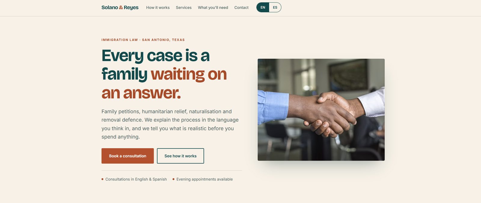
Solano & Reyes homepage — hero with headline “Every case is a family waiting on an answer.”
Study 04·Immigration law·Bilingual / reassuring

Solano & Reyes — an immigration practice where the language choice is the first design decision.

Family petitions, humanitarian relief, naturalisation and removal defence in San Antonio. The client is often paying out of savings, has been given three different answers by three different people, and is deciding whether this firm will tell them the truth about their odds.

Vance Ferrara — homepage
/assets/ds-vance-ferrara.jpg
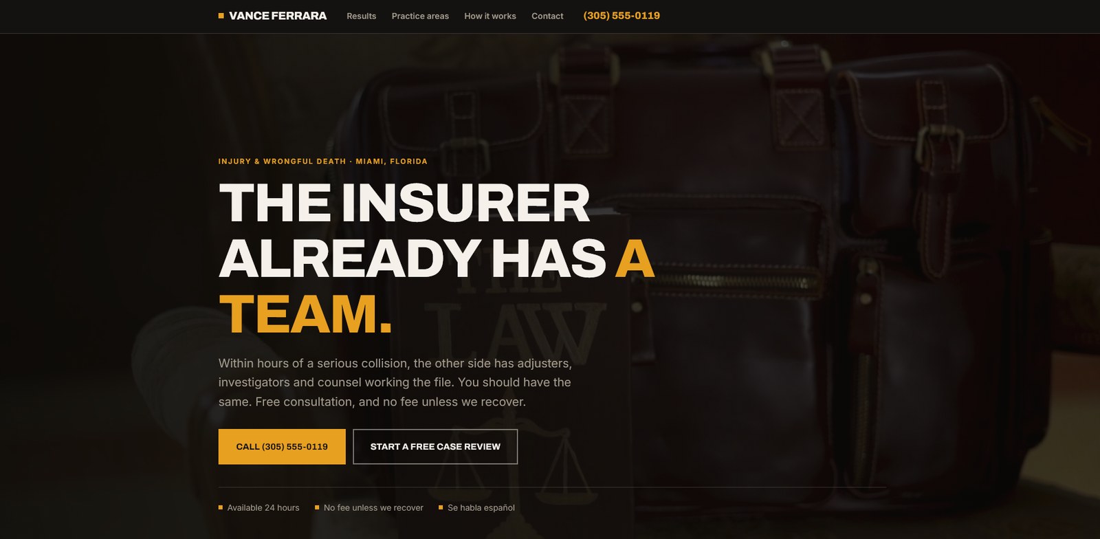
Vance Ferrara homepage — hero with headline “The insurer already has a team.”
Study 05·Injury & wrongful death·Urgent / contingency intake

Vance Ferrara — an injury practice designed for a phone call in the first week.

Miami plaintiff work on contingency, competing in the most saturated advertising market in legal. The visitor is days out from a serious collision, on a phone, and comparing four firms that all say the same three things. The site has one job, and it is the call.

Wren & Alderman — homepage
/assets/ds-wren-alderman.jpg
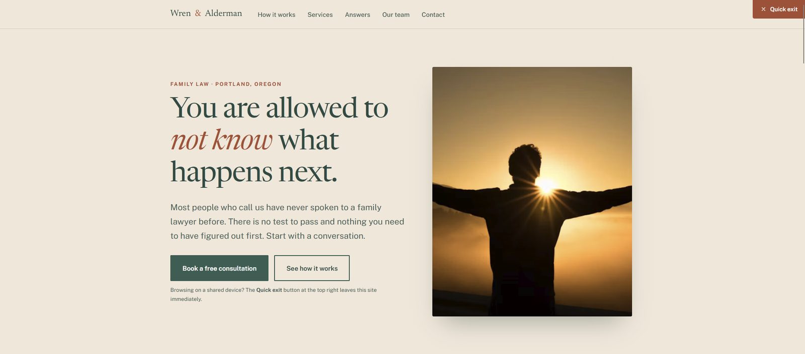
Wren & Alderman homepage — hero with headline “You are allowed to not know what happens next.”
Study 06·Family law·Quiet / trauma-aware

Wren & Alderman — family law that lowers the cost of the first contact.

Portland family law, where most enquiries come from someone who has never spoken to a lawyer and is not sure they are allowed to yet. The design problem is not persuasion, it is permission — and safety, for the visitor reading on a device someone else can see.

The reasoning

The brief, and what the design did about it.

Same process each time: understand who is buying, what they doubt, and the one action the site has to produce. Visual direction is the last decision, not the first.

Study 01

Meridian Legal Services

Litigation support · 9 offices, 5 states

View live study

Overview

Court reporting, records retrieval, service of process, e-filing, imaging, investigations, court services, and messenger — eight lines across nine offices, operating since 1991. Buyers are firm administrators and litigation operations directors who already use three or four vendors and are not looking for a fifth. The site's argument is consolidation, and the obstacle is that consolidation sounds like risk.

Approach & design decisions

01

State the offer in one line. "Everything between filing and verdict," followed by "One account, one portal, one invoice." Eight service lines are hard to hold in mind; the span between two familiar events is not.

02

Name the real reason firms switch. The consolidation section says it directly: the reason is almost never technical, it is that nobody has to chase a status update again. Written for the person whose week that actually is.

03

Answer the subcontracting fear immediately. Every office carries its own reporters, servers, and imaging capacity; nothing routes to a call centre or gets subcontracted silently. That sentence sits in the pitch, not buried in an FAQ.

04

Testimonials with operational specifics. Each client story carries firm size, services used, and tenure — "defense firm, 90 attorneys, client since 2019." Administrators calibrate against firms shaped like theirs.

05

Remove the switching cost from the close. "No minimums, no onboarding fee, no contract term." Every clause answers a procurement objection, which is what stands between interest and a first order.

Study 02

Hale & Corvin LLP

Commercial litigation · San Francisco

View live study

Overview

A fourteen-partner litigation boutique founded in 1998, with no non-equity tier and no career associates. Its buyers are general counsel who can hire anyone, and who read a small firm's website looking for the reason not to. The site has to answer seniority, capacity, and outcomes before it asks for a call.

Approach & design decisions

01

Turn the weakness into the claim. "A litigation boutique built on trial experience, not headcount" and "Fourteen partners, no associates layer" state the structure plainly. Small stops being a gap once it is the reason partners try the case.

02

Numbers where adjectives usually go. $2.4B litigated, 61 trials to verdict, 14 partners — placed immediately under the hero. Representative matters follow with outcome, forum, and year, headed "Outcomes, not adjectives."

03

Four practices, no overflow work. Each practice is numbered and paired with a one-line scope, with the staffing rule stated above them: matters go to partners who have tried that claim type. The structure is the differentiator, so the structure is visible.

04

Attorneys as proof, not decoration. Three partner profiles carry what they try, not where they went to school. Full bios sit one level down; the homepage is making a competence argument.

05

Close with a low-friction promise. "Consultations are confidential. Most calls are returned within one business day." A specific, checkable commitment converts better than an invitation to get in touch.

Study 03

Halvorsen Kite

IP & technology · Seattle

View live study

Overview

A Seattle patent, trademark and technology practice founded in 2014. Eleven attorneys, every one registered before the USPTO and holding an engineering degree. The buyer is a technical founder or in-house engineering lead who has already been handed a boilerplate application by a general practice firm, and who evaluates counsel the way they evaluate a vendor: can you read the spec, and who actually does the work.

Approach & design decisions

01

Speak to the builder. “Counsel for people who build the thing.” The headline addresses the engineer, not the general counsel, because at this stage of company there often is no general counsel.

02

Answer the handoff question in the hero. “The person who drafts your application is the person who prosecutes it.” The most common complaint about patent work is that the named partner disappears after the pitch, so the staffing model is stated before anything else.

03

Credentials as a strip of facts. Founded, attorneys, registered before the USPTO, with an engineering degree — four cells, two of which read “All.” Framed as a bar to clear rather than a boast.

04

Developer-tool visual language. Monospace labels, a faint technical grid, and a dark default with a light toggle. The aesthetic borrows from the tools the buyer works in all day, which is a credibility signal no adjective buys.

05

Navigation named after the work. Services, matters, approach, contact. Four items, lowercase, no “Insights” or “Thought leadership” — restraint reads as competence to this audience.

Study 04

Solano & Reyes

Immigration law · San Antonio, Texas

View live study

Overview

A San Antonio immigration practice handling family petitions, humanitarian relief, naturalisation and removal defence. Clients frequently arrive after a notario or a general practitioner, paying out of household savings, having been told three different things about the same case. The site has to establish honesty about outcomes and cost before it asks for a consultation, and it has to do that in Spanish as fluently as in English.

Approach & design decisions

01

Language is a switch, not a subpage. EN / ES sits in the primary navigation as a toggle. A translated site buried under a footer link tells a bilingual client which language the firm considers the real one.

02

Say what the process feels like, not what the statute is. “Every case is a family waiting on an answer.” The emotional fact is the accurate one; the statutory detail belongs on the service pages.

03

Promise realism, in the hero. “We tell you what is realistic before you spend anything.” The differentiator in this market is not expertise, it is the willingness to say a case is weak.

04

Practical reassurance under the fold line. Consultations in English and Spanish; evening appointments available. Two facts that answer whether a working parent can actually use this firm.

05

Warm palette, deliberate distance from institutional design. Cream, deep teal, and a clay red — closer to a community practice than a courthouse. Immigration clients associate cold institutional design with the agency they are afraid of.

Study 05

Vance Ferrara

Injury & wrongful death · Miami, Florida

View live study

Overview

A Miami injury and wrongful death practice working on contingency, in the most saturated legal advertising market in the country. The visitor typically arrives within days of a serious collision, on a phone, comparing several firms whose sites make identical claims. Everything on the page is measured against one action: a call placed now, or a case review submitted in under a minute.

Approach & design decisions

01

Give the visitor an opponent. “The insurer already has a team.” Undifferentiated injury sites sell the firm; this one names the thing the client is up against and the asymmetry they are in right now.

02

Make the urgency factual. “Within hours of a serious collision, the other side has adjusters, investigators and counsel working the file.” Specific and verifiable, where competitors use “act fast.”

03

The phone number is a fixed element. It sits in the navigation and it is the primary button. On mobile, tap-to-call is the conversion; anything competing with it is removed.

04

Answer money before the visitor asks. “No fee unless we recover,” beside “Available 24 hours” and “Se habla español.” Three chips covering cost, access, and language — the three reasons people do not call.

05

Heavy condensed type, photographic depth. Amber on near-black, a single full-bleed image behind the hero. The register is closer to a fight than a consultation, which is what the claim in the headline requires.

Study 06

Wren & Alderman

Family law · Portland, Oregon

View live study

Overview

A Portland family law practice. Most people who contact the firm have never spoken to a family lawyer, arrive without documents or a decision made, and half-expect to be told they are not ready. A meaningful share are browsing on a device another household member has access to. The site is built to reduce the cost of making contact rather than to argue the firm is the best one.

Approach & design decisions

01

Remove the prerequisite. “You are allowed to not know what happens next,” with “There is no test to pass and nothing you need to have figured out first.” The most common reason a family law enquiry does not happen is the belief that it is premature.

02

Safety as interface, not a disclaimer. A persistent Quick exit control sits top right, explained in plain language beneath the buttons. For a shared-device visitor this is the feature that makes the rest of the site usable.

03

Free first conversation, named as a conversation. “Book a free consultation” beside “See how it works.” The second path exists because a proportion of visitors need to understand the process privately before speaking to anyone.

04

Quiet typography, no adversarial language. A high-contrast serif, a muted forest and clay palette, generous line spacing. No gavels, no courthouse steps, nothing that frames the situation as a fight the visitor has to win.

05

Answers before credentials. How it works, Services, Answers, Our team. Questions come before the firm, because the visitor is triaging their own situation, not yet choosing a lawyer.

Why they look nothing alike

The direction comes out of the brief, not a house style.

A support vendor selling consolidation, a boutique arguing seniority, a patent practice talking to engineers, and a family law firm trying to make one phone call easier are making different arguments to different buyers. Running them through one visual template would flatten the only thing that matters — whether the site answers the doubt its buyer actually arrives with.

Want a study built around your firm?

Book a free consultation and we'll scope a direction against your practice area, competitors, and intake goals.